Getting your product pages right is a key part of your visitors journey, as this is where visitors will learn crucial information about the product. A well-designed eCommerce product page is a careful balance to convert visitors. You don't want your page to be too bare, too busy or too complicated.
Whilst different audiences will want different things from their shopping experience (so it's important you understand more about your users as well as following best practices), essentially your eCommerce product page is a window into your product before conversion. So providing the right information is key.
Every aspect of your website is an opportunity to increase conversion, and this includes your Product Pages!
The 5 top tips below will help you you to optimise your eCommerce product pages to provide your users with the best experience.
1. Improve the media in your media carousel
a) Show photographs that are zoomed in enough to make all details on product packaging visible.
Taking high quality imagery which shows product packaging details can give the impression of a higher quality website. It is also helpful when selling consumable goods to get across key information in a slightly more visual format than in a product description.
b) Show your product on a plain white background to allow users to focus on the product itself without interference from the surrounding context.
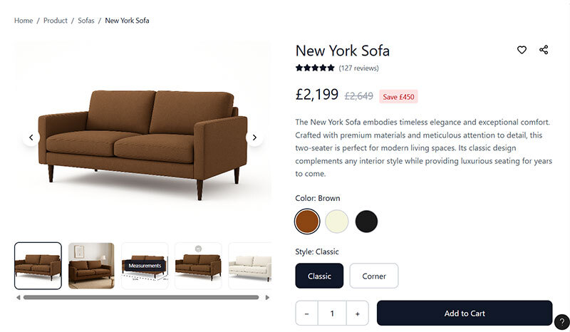
c) Show all variations of the product available on that PDP.
Users are less likely to buy something if they don’t know what it looks like. Whilst this may be more difficult if you have lots of options (such as different items and sizes on a fashion e-commerce site), showing all variations when you only have a few is necessary.
For example, if you sell a sofa in a corner version and a standard version, either of which can be bought in one of three colours, at least 6 product images would be necessary (one for each combination).
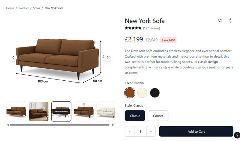
d) Show measurement information on photographs.
Reading measurement information on photographs can be more intuitive than reading them in a specifications section as the user can see which measurement relates to which dimension quicker (for example when there is width and length or width and depth it can sometimes be hard to distinguish which is which).
This isn’t to say you should do away with your specifications section, just that adding measurements to your media carousel will enhance the user experience.
e) Show photos of the product from multiple angles and/or include a 360-degree interactive element.
Seeing something from multiple angles helps replicate in-person shopping behaviour where users would handle or move around a product. This is more important for some items than others. For example, when selling a mobile phone, users will likely want to see what the back looks like as well as the front.
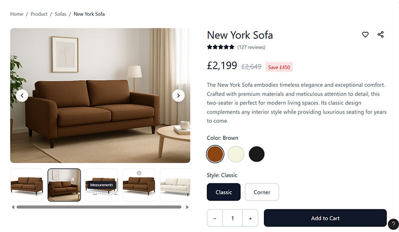
f) Show the product in situ or in use to give users additional context, help them imagine owning it, and create a sense of desire.
Place this as your second image in the carousel to increase the chance that it will be seen.
g) Provide video for luxury items to really sell the value of them.
If done right, video can be used to suggests prestige more than just photos. It is important to use high-quality video as poor quality could have the adverse effect. Also be aware of the impact that adding video makes to your site speed, if it slows it down a lot, the payoff may not be worth it as a slow site leads to task abandonment.
2. Address likely fears, doubts, and uncertainties
Fears, doubts and uncertainties create hesitation, and hesitation can lead to task abandonment.
a. If you don’t have a section on your PDPs about delivery and returns/refunds, consider adding this.
You don’t need to go into great detail, but you should aim to be reassuring and provide links to the appropriate policies.
b. Review your customer support conversations to discover what users are asking questions about and then build the answers into the main copy or a FAQ section.
c. Carry out user research with your target audience to discover what could be stopping people from buying, even if they choose not to reach out.
3. Write compelling product descriptions
Too often product descriptions are overlooked. They are just used as a place to describe the product, not to sell it. Imagine you were in front of the user trying to convince them to buy. Would you simply describe what they were already looking at? Probably not. You would possibly talk about its benefits, if it’s handmade, it’s quality materials, expert design, or something else similar that creates a desire in the mind of the user.
Aim to keep your product descriptions short, but don’t undersell your products. If you can, use specific wording such as ‘bought by 10,000+ people over 40’ for an anti-aging solution. Aim to address the benefits users are likely seeking. Again, moderated user research can help here as you uncover your target audience’s motivations so you can really tap into these.

4. Upgrade your product reviews section
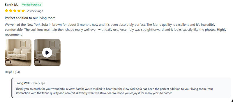
a. Allow users to upload photos and video alongside their review.
Reviews with media are more engaging than text alone and can appear more genuine, helping build trust through enhanced social proof.
b. Make sure you can reply to reviews on your site so other users can see your responses.
This is very important for negative reviews as it shows good customer service. It is also great to build trust with users when positive reviews are responded to as it shows there are real people behind the company, applying the liking principle.
c. Allow users to rate reviews as helpful and sort by most helpful.
If you can get users to start interacting with each other by indicating a review was helpful you can help create a loose sense of community. It is also a powerful way to apply social proof as not only are users seeing (hopefully) positive reviews from people like them, they are also seeing that others have approved that message, applying this trust factor twice.
d. Provide an AI summary of what customers have said to help users quickly get the gist of the benefits and drawbacks of a product.
Users may want to know what other people think, but it’s unlikely they want to sit and read every review, (which is why rating summaries are so powerful). We are now seeing a shift towards AI summaries as well as rating summaries as these provide more meaningful information that the rating summary could alone.
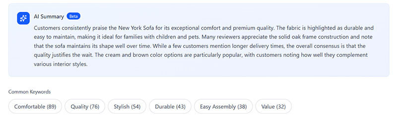
e. Provide the option for users to click on a key word to show reviews containing that key word.
Similar to providing an AI summary, allowing users to click on a key word reduces the amount that users need to read to understand if the product is right for them. As an added benefit over an AI summary, the key word is more likely to be targeted at what the user is looking for, making the reviews they read more compelling.
5. Indicate low stock availability
Indicating low stock availability applies the scarcity effect. Scarcity is one of Cialdini’s 7 principles of influence. This effect describes how something being in short supply makes it more desirable, encouraging more impulsive decision making.
Scarcity only works well when it’s believable. Users lose trust if they believe a site is deliberately trying to manipulate them by showing a false availability count. For example, if the number of rooms left on a hotel booking site seems to change when a page is reloaded, it could be perceived as fake.
An example of scarcity in practice can be seen in the selling of a limited-edition print of art versus the original piece. The original piece is one-of-a-kind and so has greater value because it is very scarce. The limited-edition print could be perceived as less valuable the more prints are available, also applying the scarcity principle, but to a lesser extent. If there were 150 prints available out of 150, users may also question how desirable it is. But if there are only 2 left, then this is worth drawing attention to this fact.
Summary
Now you have 5 tips for optimising product pages (PDPs). These centre around improving engagement and tapping into motivations through your media and messaging, enhancing your social proof to build trust, and incentivising action by applying the scarcity principle. It's important to highlight that you should always test before making changes to your website, even after user research and careful decision making.
As I mentioned, not every one of these tips is going to apply to you. If you want help identifying which of these would be a good fit and uncovering more ways you can improve your PDPs, then an audit is a great place to start. Credo offer two kinds of audit. The first is an Essential Audit, which looks at your site through the eyes of best practice, user psychology, and evidence from behaviour tracking software. The second is our Full CRO Audit, which takes a similar approach but also delves into your analytics to uncover insights.