Over the last 18 months, our product focus has been on redesigning our UI. The goal was to improve processes, speed up workflows, allow for better collaboration and improve our users experience.
This has been a pivotal step in the progression of Webtrends Optimize; not only for the additional capabilities and advanced features we will be able to offer our clients and partners, but also the improved experience it will provide them.
The feedback about the previous UI was that it had become a little less intuitive for clients and partners to use, and our goal is always to provide the best technology for our users so they can achieve their experimentation goals.
The first phase of the UI was released to customers in February 2025 as we began to roll out the first wave of new features and design. Now that all of our clients and partners have transferred over to use the new UI, wto7, we have been exploring the impact of these changes on testing, results, usability, efficiency, and more.
Highlights from our users
Throughout the project, we have adopted a customer-centric design process, gathering feedback through 1-1 interviews to build the best product we can. This is the first time we've included customers in the early stages of the design process. The result is our users are now getting almost exactly what they asked for, which is great for them, and great for us too!
Some of the exciting changes that users can expect to see in the latest UI update include:
- A customisable dashboard – See your data your way.
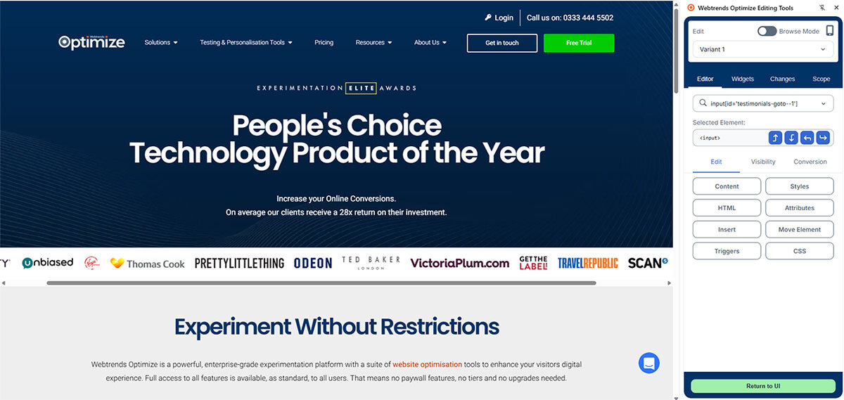
- A new futureproof visual editor – The latest browsers, less functional problems.
- Re-built Advanced editor – Giving more creative freedom to our users.
- Functions streamlined and de-duped & workflows simplified.
Our head of Customer Success, James Harber, has been working closely with our clients and partners over the last 12 months to ensure the work we have been undertaking to redesign the product is really going to make a difference.
The feedback throughout the process has been overwhelmingly positive and we are seeing greater results than we initially planned. As well as actually redesigning the UI, we have put a lot of effort into validating feature requests, watching users engage with our product and uncovering User Experience wins.
What Users Love
The changes to the UI have meant users can benefit from improved and intuitive functionality, leading to a more seamless experience. Our users have said they love the new look and feel of the UI, and it is much sleeker and easier to navigate. Reporting and analysis is easier and faster, meaning users can do more with their time.
This also makes feeding back to your team easier than ever, so you can keep everyone updated with your experimentation progress. Switching between user sessions, total levels and conversions is easy, so you can access lots of different things at once.
We have many valued clients and gaining their insight and feedback has been an important part of our process. Caitlan Morton, UX Design and Experimentation Manager at PrettyLittleThing said, ‘Being able to see all the steps on one page makes it so much easier to jump back and forth without having to click through different tabs. I’m also a huge fan of the new code builder – the function prompts make it feel more like a proper development environment.’
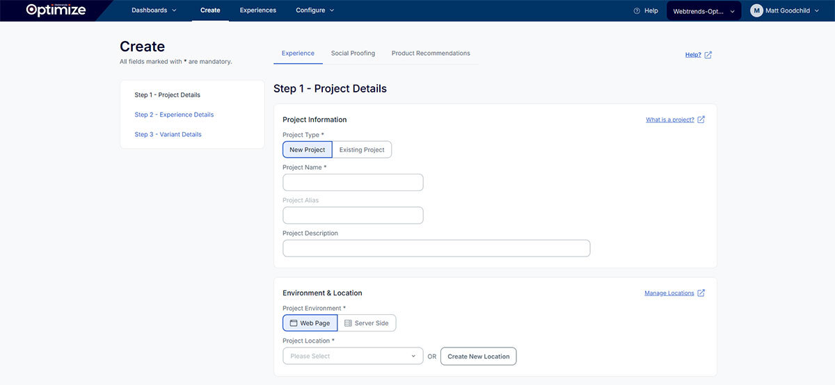
Some specific things that users have called out are the changes to the Visual Editor and Creating a Project Page. The change to the Visual Editor means that there is a distinction between editing, hiding, visibility and widgets which adds flexibility. Creating a project page is now a very clear and clean layout as you can follow a step-by-step process, and there is logical progression from each project, experience and variant.
Our Head of Product, Sandeep Shah, said ‘Our Visual Editor is futureproof. It uses the latest browser APIs and takes away functional problems I've seen in countless other platforms. I'm particularly excited about our new Advanced Editor. It gives us a platform to do some really creative things with AI that we've not been able to do previously.’
What difference does this make to what users can achieve?
One of the main things the UI redesign has improved for our users is the speed at which they can do things; building AB tests is quicker and easier than ever. A more seamless and straightforward building experience is a common theme of the feedback, with our consultants reporting that the build and QA stage is much easier to utilise, and also easier to explain to clients how to QA projects.
This means clients can build more tests themselves, speeding up workflows and increasing productivity. Tool tips, guidance and help docs have made clients more independent in understanding and exploring the product themselves. For example, simple tests can now be built in the Visual Editor without users having to raise tickets for bug fixes or improved functionality.
Elena Cotar, CRO Developer at Community Fibre, said, ‘From a developer perspective, one of the best improvements is the new code editor and VS code integration. It saves me so much time not having to jump between editors, and for me that’s the most important thing as time really matters!’.
In terms of analysis, exporting data has become quicker and more intuitive. Reporting is often a sticky point during your conversion strategy, but we are incredibly proud of the work we have done to improve this whole process.
The UI redesign has looked to address previous pain points around the ease of use of the product. Our users say it is now easier to navigate in the product, use the features, group data together to see results, easily clone experiences and projects, and filter results based on what you want to see.
Viewing results and insights
The goal of our redesign was to ensure that people of all skill levels could use the platform the same way and understand the data and results in front of them.
When the software is easy to use, you are more likely to spend time using it, look for additional insights and use various filters and dimensions. This was really important for us as we wanted to ensure our clients wanted to use the UI and also collaborate with their team on it.
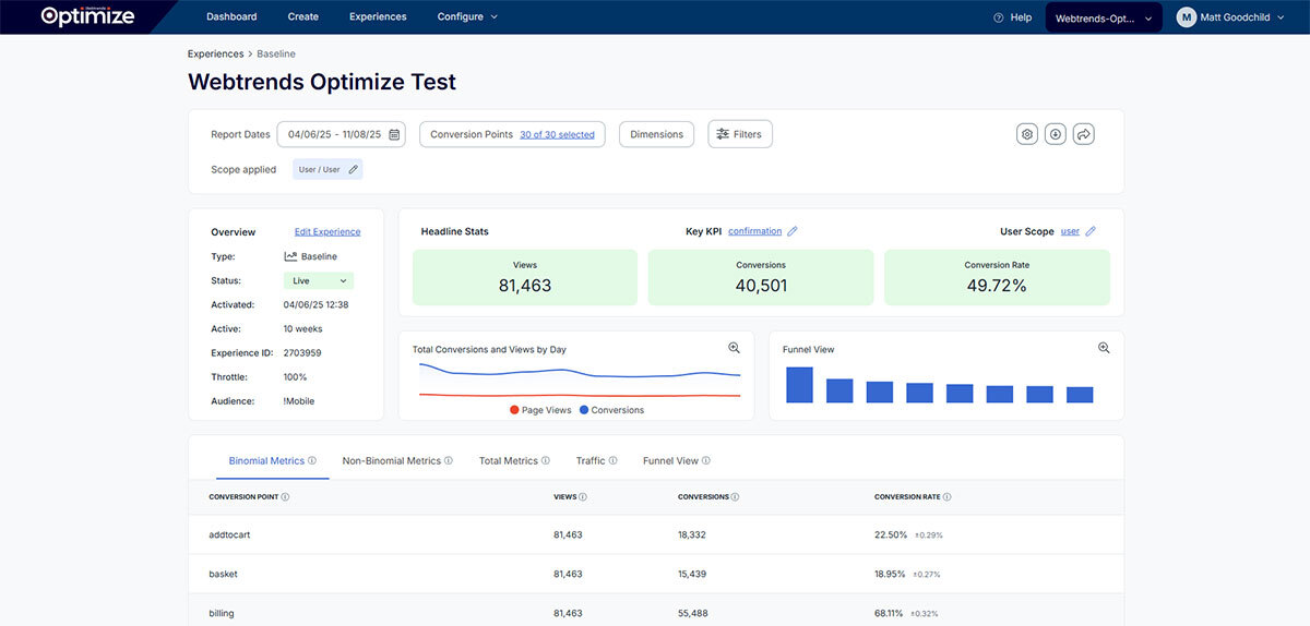
One of the main benefits of the redesign is that clients are able to assess the performance of their tests much quicker now, sharing reports and creating a breakdown of segments, devices and various groupings.
Alla Bennett, Senior Optimisation Consultant, said ‘The emphasis has shifted from trying to just view the data, to deciding what we are going to do with what we have learnt and the knowledge we have gained.’
The new UI means you can run a top-level analysis of a test within a couple of minutes, meaning nearly instant access to insights and data. For our consultants, they can use the dashboard to easily see if a test has reached significance or if it needs more digging into.
Users can collaborate across a variety of different teams in their business. For example, one of our users said their website app developers can now code directly into the Webtrends Optimize product and test within the tool, working side by side with User Experience developers. It’s made the whole process more streamlined and encouraged teams working together.
What’s next for wto7?
Feedback has driven the redesign from the very start and will continue to do so. Our clients and partners are the driving force of everything we do, and ideas will continue to be validated before changes are made.
Our main areas of focus were around usability and efficiency. We know these two areas support both new users as well as existing users, so we wanted to make it easy as possible for clients, partners and the internal team to use the product as well reduce the time needed to achieve it. We will continue to work on this to provide the best product.
Users can expect to see more reporting functionality so they can do more, and be more efficient, when automating out the painful parts of analysis. Surveys continue to be a key feature for us at Webtrends Optimize, and we will continue our focus on this to improve the solution.
We are also looking to add a stack of AI features. This will be to support building, planning, running and analysing experiments, making them more accessible and faster than ever before.
We have completely built our UI from scratch, and what we have achieved in 12 months is something our whole team are incredibly proud of. We will continue to iterate and gather feedback from our clients and partners to provide the best experience for them and maintain our high standards.
